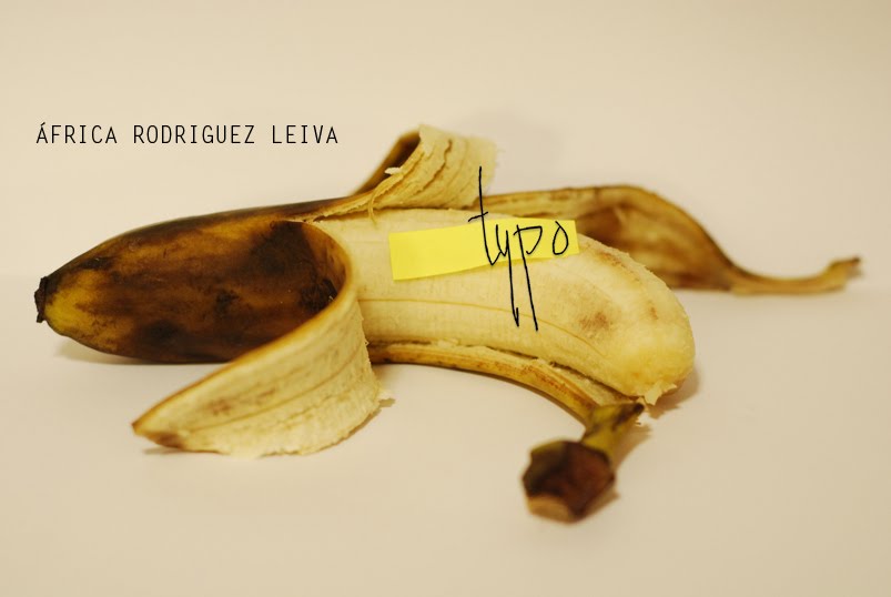
‘Typography in Contemporary Art and Viceversa’
Regarding my Art Studies, the path I have always followed is more related to painting, sculpture and photography than to graphic design itself, which although not being art as such, it looks very much like it.
The theme I am about to develop in my essay is based on the use of typography in contemporary art, and in typography design art; and that is the reason why I have entitled my work as ‘Typography in Contemporary Art and Viceversa’. I think it is really clear and concise when it comes to focus on the topic.
To begin with, I would like to use as a reference the first apparitions of typography in art, by the hand of Braque (belonging to Cubism), Picasso and also Gris. I want to analyse the different typographies that have been used through the different stages of contemporary art. I would like to go into the works of some artists who work with typography but in different ways in depth.
First of all, I will be working on George Grosz, Jasper Johns, Mario Merz, Barbara Kruger, Ed Ruscha and Nancy Spero, among others, and avant-gardes such as Dadaism (Jean Arp) y the Bauhaus School.
With respect to the art in typography, I would like to analyse some of the most important typographies that we know, although not a large number. Define and compare between they.
‘The graphic design is also expressed through a third language, a very different one, I must say: the block letters, that is, typography, wich it belongs so clearly to graphic design, that its very presence in the printed paper surface is enough to distinguish the design of (or what could be) a work of art. We say that with reservations, given that, observed from this perspective, the History of Art is filled with words.’ E. Satué. ¹(Translated by me)
Taking this quotation as a reference, I think that this is an interesting idea about the difference between graphic design and art, and how typography is present in both cases.
This essay will be full of images of the works of art of the previously mentioned artist as well as from the collection of the typographies that I will analise.
I can say that it will be a very visual essay, due to the great ammount of pictures that I am including
¹ “ El diseño gráfico también se expresa con un tercer lenguaje, bien distinto por cierto: las letras de imprenta, es decir, la tipografía, que hasta tal punto pertenece que basta su presencia en la superficie de un papel impreso para distinguer enseguida un diseño de o que podría seruna obra de arte.
Decimos esto con todas las reservas, puesto que, observada desde esta perspectiva, la historia del arte está salpicada de letras.” (Satué 2007: 13) El arte en la Tipografía y tipografía en el arte: compendio de tipografía artística. (The art on typography and typography on the art: Compendium of artistic typography. Siruela, España.
Bibliography:
Elam,K. (1951) Expressive typography. The World as Image. New York Van Nostrand Reinhold
Geldzahler, H. (1969) New York painting and sculpture 1940 – 1970, The Pall Mall Press Ltd, London
Greenberg, A.C. (1979) Artist and Revolution, Dada and the Bauhaus, 1917- 1925. Ann Arbor, Michigan.
Carter, R. (1997) Experimental Typography , New York.
Satué,E. (2007) El arte en la Tipografía y tipografía en el arte: compendio de tipografía artística. (The art on typography and typography on the art: Compendium of artistic typography. Siruela, España.
Kate, L (1990) Love for sale: The words and pictures of Barbara Kruger. London: Harry N. Abrams
Ryan, D.(2001) Letter Perfect: The art of modernist typography, 1896 – 1953 . Rohnert Park, Calif; Fullbridge: Pomegranate.
Dood, E. Gordon, M. (1990) Decorative Typography. Oxford: Paidon