
Ironically, I have written this text with Arial..

Diferencias?
Helvética fue creada en 1957 por Max Miedinger y Eduard Hoffmann como la tipografía-manifiesto del Modernismo. Más tarde, en 1982 Robin Nicholas y Patricia Saunders crearon la Arial, que aparece desde 1990 en el paquete básico de TrueType para Internet y en Microsoft. Esta es la razón de que se haya convertido en una tipografía tan popular a lo largo del ancho mundo.
Ironic Sans ha creado un juego. Ha cogido algunos logos que originalmente fueron creados con Helvetica y los ha reconstruido con Arial. Eres capaz de acertar cuáles son los correctos?
Aun así, la Helvetica es la tipografía favorita de los diseñadores y está considerada como la mejor tipografía de todos los tiempos. Qué pensais al respecto?
Irónicamente, he escrito este texto con Arial..
Why do you think a typeface like Helvetica (or Arial) might be so popular? Why do designers return to them after so many years? Is there something specific about this kind of sans-serif font that means they'll never be subject to fashion or lose their appeal?
ResponderEliminarWhy haven't any more recent typeface designs moved ahead of Helvetica? After Modernism and the ideas that this kind of typeface sought to address, is there anywhere else that typeface design might go?
Are the minor adjustments and differences between Arial or Helvetica noticed by anyone other than typographic designers?
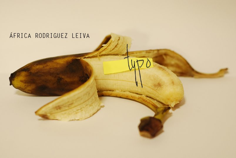
I like the image at the top of the blog - is typography literally or metaphorically a banana skin for designers? Do we often slip up?
Paul